Custom Themes
████████╗██╗  ██╗███████╗███╗   ███╗███████╗███████╗
╚══██╔══╝██║  ██║██╔════╝████╗ ████║██╔════╝██╔════╝
   ██║   ███████║█████╗  ██╔████╔██║█████╗  ███████╗
   ██║   ██╔══██║██╔══╝  ██║╚██╔╝██║██╔══╝  ╚════██║
   ██║   ██║  ██║███████╗██║ ╚═╝ ██║███████╗███████║
   ╚═╝   ╚═╝  ╚═╝╚══════╝╚═╝     ╚═╝╚══════╝╚══════╝
DankMaterialShell supports custom color themes using arbitrary color schemes. You can create your own themes or use pre-made ones.
Theme Structure
Custom themes are defined in JSON files that generally map to matugen color keywords. Themes can have separate dark and light variants, or use a single color scheme for both modes.
Complete Theme Example
{
  "dark": {
    "name": "Cyberpunk Electric Dark",
    "primary": "#00FFCC",
    "primaryText": "#000000",
    "primaryContainer": "#00CC99",
    "secondary": "#FF4DFF",
    "surface": "#0F0F0F",
    "surfaceText": "#E0FFE0",
    "surfaceVariant": "#1F2F1F",
    "surfaceVariantText": "#CCFFCC",
    "surfaceTint": "#00FFCC",
    "background": "#000000",
    "backgroundText": "#F0FFF0",
    "outline": "#80FF80",
    "surfaceContainerLowest": "#0A0A0A",
    "surfaceContainerLow": "#152315",
    "surfaceContainer": "#1A2B1A",
    "surfaceContainerHigh": "#264026",
    "surfaceContainerHighest": "#33553F",
    "error": "#FF0066",
    "warning": "#CCFF00",
    "info": "#00FFCC",
    "matugen_type": "scheme-expressive"
  },
  "light": {
    "name": "Cyberpunk Electric Light",
    "primary": "#00B899",
    "primaryText": "#FFFFFF",
    "primaryContainer": "#66FFDD",
    "secondary": "#CC00CC",
    "surface": "#F0FFF0",
    "surfaceText": "#1F2F1F",
    "surfaceVariant": "#E6FFE6",
    "surfaceVariantText": "#2D4D2D",
    "surfaceTint": "#00B899",
    "background": "#FFFFFF",
    "backgroundText": "#000000",
    "outline": "#4DCC4D",
    "surfaceContainerLowest": "#FAFFFA",
    "surfaceContainerLow": "#F9FFF9",
    "surfaceContainer": "#F5FFF5",
    "surfaceContainerHigh": "#EBFFEB",
    "surfaceContainerHighest": "#E1FFE1",
    "error": "#B3004D",
    "warning": "#99CC00",
    "info": "#00B899",
    "matugen_type": "scheme-expressive"
  }
}
Single Mode Theme
For themes without light/dark variants, define colors at the top level:
{
  "name": "Theme Name",
  "primary": "#eeeeee",
  "primaryText": "#000000",
  "surface": "#ffffff",
  "surfaceText": "#000000",
  "background": "#f5f5f5",
  "backgroundText": "#000000",
  "outline": "#cccccc",
  "matugen_type": "scheme-tonal-spot"
}
Required Color Properties
Primary Colors
primary- Main accent color for buttons, highlights, and active statesprimaryText- Text color contrasting with primary backgroundprimaryContainer- Variant of primary for containers
Secondary Colors
secondary- Supporting accent color for variety and hierarchysurfaceTint- Tint color applied to surfaces (usually derived from primary)
Surface Colors
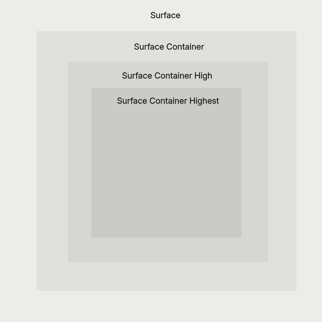
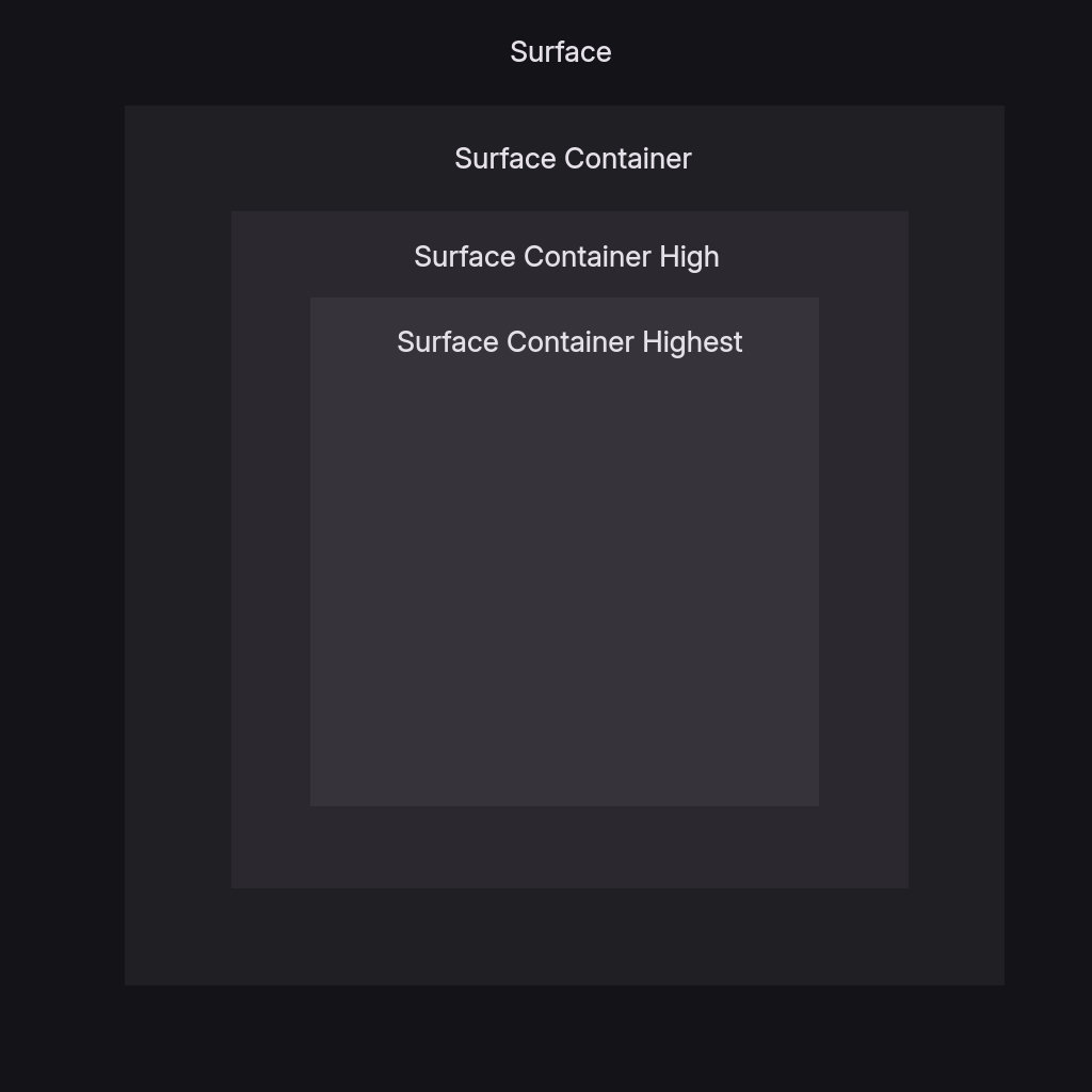
surface- Default surface color for cards and panelssurfaceText- Primary text color on surface backgroundssurfaceVariant- Alternate surface for subtle differentiationsurfaceVariantText- Text color for surfaceVariant backgroundssurfaceContainerLowest- Lowest elevation container (darkest in dark mode, lightest in light mode) — matugen-only, see note belowsurfaceContainerLow- Low elevation container, between surface and surfaceContainer — matugen-only, see note belowsurfaceContainer- Container surface, slightly different from surfacesurfaceContainerHigh- Elevated container for layered interfacessurfaceContainerHighest- Highest elevation container for top-level surfaces
:::note Not all colors are used by DMS itself
A few keys complete the Material palette but aren't rendered by DMS's own UI —
currently surfaceContainerLowest, surfaceContainerLow, and backgroundText. They are
still required and are exported to matugen templates (VS Code, KDE, Firefox, Zed, etc.), so
external apps themed by DMS use them even though the shell does not.
:::
Background Colors
background- Main background color for the interfacebackgroundText- Text color for background areas — matugen-only, see note above
Outline
outline- Color for subtle borders, dividers, muted icons, and extra subtle text
Optional Properties
Semantic Colors
error- Error states, delete buttons, critical warningswarning- Warning states and caution indicatorsinfo- Informational states and neutral indicators
Matugen Type
The matugen_type property controls the color scheme algorithm used for system app theming. Default is scheme-tonal-spot if not specified.
Available options:
scheme-content- Content-based color extractionscheme-expressive- Expressive, vibrant color schemesscheme-fidelity- High fidelity to source materialscheme-fruit-salad- Colorful, fruit salad-like schemesscheme-monochrome- Monochromatic color schemesscheme-neutral- Neutral, subdued color schemesscheme-rainbow- Rainbow-like color schemesscheme-tonal-spot- Tonal spot color schemes (default)
Example Themes
Pre-built example themes are available in the DankMaterialShell repository:
- Cyberpunk Electric - Neon green and magenta cyberpunk aesthetic
- Hotline Miami - Retro 80s hot pink and blue
- Miami Vice - Classic teal and pink vice aesthetic
- Synthwave Electric - Electric purple and cyan synthwave
Applying Custom Themes
Via Settings UI
- Open Settings → Theme & Colors
- Select Custom from the theme dropdown
- Choose your theme file path
Via Configuration File
Edit ~/.config/DankMaterialShell/settings.json:
{
  "currentThemeName": "custom",
  "customThemeFile": "/path/to/mytheme.json"
}
Live Editing
Custom theme files are reactive - editing the JSON file automatically updates the shell if it's the currently active theme.
Theme Development Tips
- Start from examples: Use the pre-built themes as templates
- Adjust incrementally: Change one color at a time to see the impact
- Test both modes: If providing dark/light variants, test both thoroughly
- Consider contrast: Ensure text colors have sufficient contrast with backgrounds
- Experiment with matugen_type: Different schemes work better with different color palettes
- Version control: Store themes in your dotfiles for easy synchronization