Custom Themes
████████╗██╗  ██╗███████╗███╗   ███╗███████╗███████╗
╚══██╔══╝██║  ██║██╔════╝████╗ ████║██╔════╝██╔════╝
   ██║   ███████║█████╗  ██╔████╔██║█████╗  ███████╗
   ██║   ██╔══██║██╔══╝  ██║╚██╔╝██║██╔══╝  ╚════██║
   ██║   ██║  ██║███████╗██║ ╚═╝ ██║███████╗███████║
   ╚═╝   ╚═╝  ╚═╝╚══════╝╚═╝     ╚═╝╚══════╝╚══════╝
DankMaterialShell supports custom color themes using arbitrary color schemes. You can create your own themes or use pre-made ones.
Theme Structure
Custom themes are defined in JSON files that generally map to matugen color keywords. Themes can have separate dark and light variants, or use a single color scheme for both modes.
Complete Theme Example
{
  "dark": {
    "name": "Cyberpunk Electric Dark",
    "primary": "#00FFCC",
    "primaryText": "#000000",
    "primaryContainer": "#00CC99",
    "secondary": "#FF4DFF",
    "surface": "#0F0F0F",
    "surfaceText": "#E0FFE0",
    "surfaceVariant": "#1F2F1F",
    "surfaceVariantText": "#CCFFCC",
    "surfaceTint": "#00FFCC",
    "background": "#000000",
    "backgroundText": "#F0FFF0",
    "outline": "#80FF80",
    "surfaceContainer": "#1A2B1A",
    "surfaceContainerHigh": "#264026",
    "surfaceContainerHighest": "#33553F",
    "error": "#FF0066",
    "warning": "#CCFF00",
    "info": "#00FFCC",
    "matugen_type": "scheme-expressive"
  },
  "light": {
    "name": "Cyberpunk Electric Light",
    "primary": "#00B899",
    "primaryText": "#FFFFFF",
    "primaryContainer": "#66FFDD",
    "secondary": "#CC00CC",
    "surface": "#F0FFF0",
    "surfaceText": "#1F2F1F",
    "surfaceVariant": "#E6FFE6",
    "surfaceVariantText": "#2D4D2D",
    "surfaceTint": "#00B899",
    "background": "#FFFFFF",
    "backgroundText": "#000000",
    "outline": "#4DCC4D",
    "surfaceContainer": "#F5FFF5",
    "surfaceContainerHigh": "#EBFFEB",
    "surfaceContainerHighest": "#E1FFE1",
    "error": "#B3004D",
    "warning": "#99CC00",
    "info": "#00B899",
    "matugen_type": "scheme-expressive"
  }
}
Single Mode Theme
For themes without light/dark variants, define colors at the top level:
{
  "name": "Theme Name",
  "primary": "#eeeeee",
  "primaryText": "#000000",
  "surface": "#ffffff",
  "surfaceText": "#000000",
  "background": "#f5f5f5",
  "backgroundText": "#000000",
  "outline": "#cccccc",
  "matugen_type": "scheme-tonal-spot"
}
Required Color Properties
Primary Colors
primary- Main accent color for buttons, highlights, and active statesprimaryText- Text color contrasting with primary backgroundprimaryContainer- Variant of primary for containers
Secondary Colors
secondary- Supporting accent color for variety and hierarchysurfaceTint- Tint color applied to surfaces (usually derived from primary)
Surface Colors
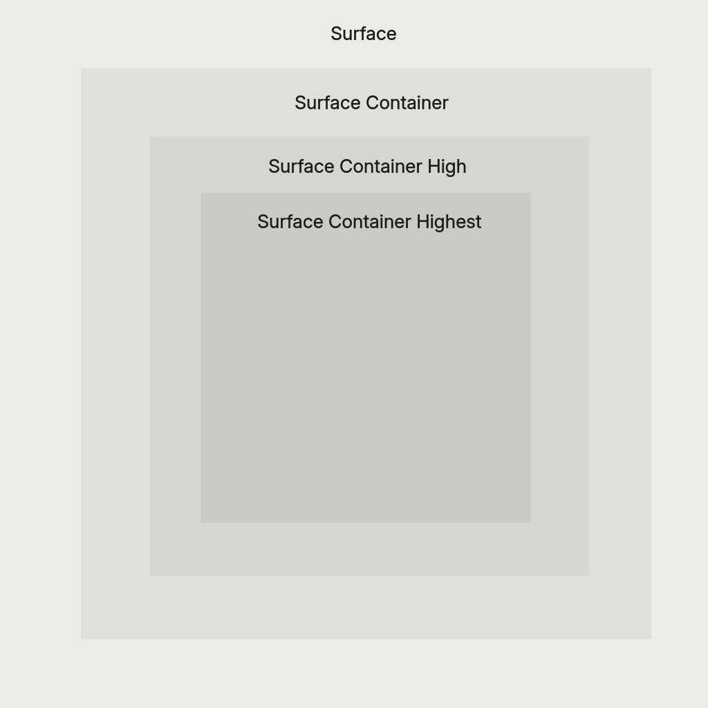
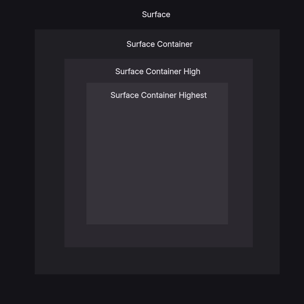
surface- Default surface color for cards and panelssurfaceText- Primary text color on surface backgroundssurfaceVariant- Alternate surface for subtle differentiationsurfaceVariantText- Text color for surfaceVariant backgroundssurfaceContainer- Container surface, slightly different from surfacesurfaceContainerHigh- Elevated container for layered interfacessurfaceContainerHighest- Highest elevation container for top-level surfaces
Background Colors
background- Main background color for the interfacebackgroundText- Text color for background areas
Outline
outline- Color for subtle borders, dividers, muted icons, and extra subtle text
Optional Properties
Semantic Colors
error- Error states, delete buttons, critical warningswarning- Warning states and caution indicatorsinfo- Informational states and neutral indicators
Matugen Type
The matugen_type property controls the color scheme algorithm used for system app theming. Default is scheme-tonal-spot if not specified.
Available options:
scheme-content- Content-based color extractionscheme-expressive- Expressive, vibrant color schemesscheme-fidelity- High fidelity to source materialscheme-fruit-salad- Colorful, fruit salad-like schemesscheme-monochrome- Monochromatic color schemesscheme-neutral- Neutral, subdued color schemesscheme-rainbow- Rainbow-like color schemesscheme-tonal-spot- Tonal spot color schemes (default)
Example Themes
Pre-built example themes are available in the DankMaterialShell repository:
- Cyberpunk Electric - Neon green and magenta cyberpunk aesthetic
- Hotline Miami - Retro 80s hot pink and blue
- Miami Vice - Classic teal and pink vice aesthetic
- Synthwave Electric - Electric purple and cyan synthwave
Applying Custom Themes
Via Settings UI
- Open Settings → Theme & Colors
- Select Custom from the theme dropdown
- Choose your theme file path
Via Configuration File
Edit ~/.config/DankMaterialShell/settings.json:
{
  "currentThemeName": "custom",
  "customThemeFile": "/path/to/mytheme.json"
}
Live Editing
Custom theme files are reactive - editing the JSON file automatically updates the shell if it's the currently active theme.
Theme Development Tips
- Start from examples: Use the pre-built themes as templates
- Adjust incrementally: Change one color at a time to see the impact
- Test both modes: If providing dark/light variants, test both thoroughly
- Consider contrast: Ensure text colors have sufficient contrast with backgrounds
- Experiment with matugen_type: Different schemes work better with different color palettes
- Version control: Store themes in your dotfiles for easy synchronization